Posted by Geoff June 04, 2007
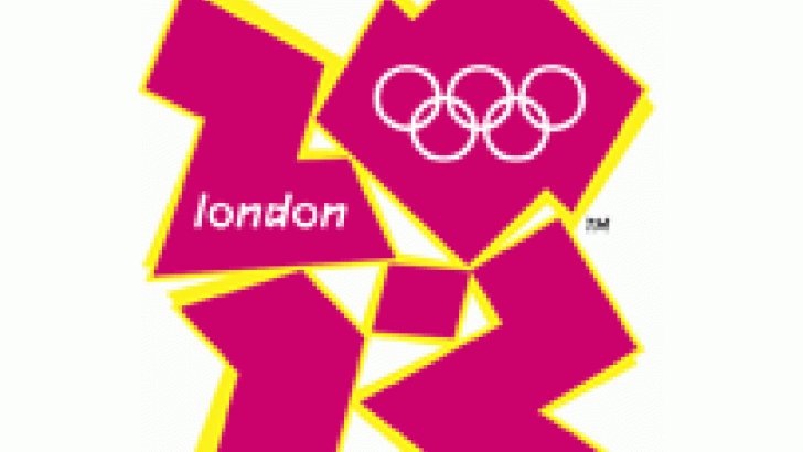
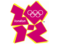
Not toy-related but as a resident of our fair capital i'll be seeing (and paying for) this logo for the next 5 years so it's worth a look.
You thinking "they paid an agency £400,000 for that"? Me too. Apparently it's meant to symbolise the 4 pillars of the games and appeal to 'da yoof' but really it looks like a flyer for a techno night in Shoreditch.
I'm a sucker for the older posters myself....Munich - love how they ignored the Olympic rings completely, and Moscow just because it's nice and clean.
 It doesn't excite me about the games or any of the other branding nonsense they spouted at the launch. I suppose it's sorta 'now' in terms of design like the 72 and 80 designs. Maybe it says more about he lack of design skill in general right now?
Categories:
Similar posts
-
 Wednesday, June 29, 2016 - 11:24amYou probably remember the Wave City Dining Table and Coffee Table from St
 -
 Thursday, April 21, 2016 - 2:04pmAh, truth in advertising. Swedish artist Viktor Hertz is following up his snarky rebrands of famous logos with a new series of designs.
 -
 Wednesday, April 6, 2016 - 3:17pmLast month we took a look at some triangle houses. Let's add five more angles this month.
 Clutter is a FREE monthly print publication covering all things Designer Toy and Sub-Culture art. Founded in 2004 in the good old United Kingdom, Clutter moved to NYC in 2009 where it continues to grow.