Posted by Miranda May 23, 2008
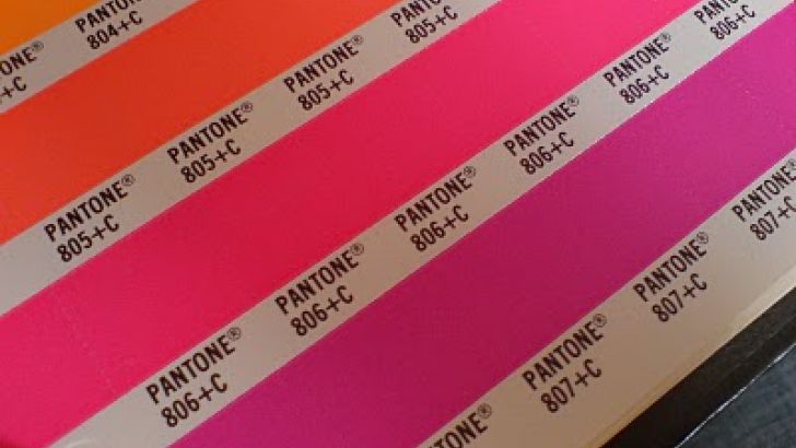
So this could have been a pretty funny mistake... So this could have been a pretty funny mistake... When specifying the colours for our next toy design (i'm not saying any more than that yet), we put down the wrong Pantone number, and picked a fluorescent pink.. as shown above (806c). It should have in fact, been more like the pink below (230). See now there is a major difference, and could have resulted in a very ugly design!! Note to self, use the Pantone books that are sitting on the shelf next time!!
 Clutter is a FREE monthly print publication covering all things Designer Toy and Sub-Culture art. Founded in 2004 in the good old United Kingdom, Clutter moved to NYC in 2009 where it continues to grow.