Posted by Nick March 10, 2011
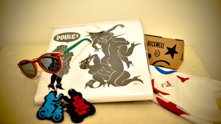
You may or may not already be aware of the fact that Rockwell is the brainchild of Parra, an outlet brand for his personal exploits in the world of apparel and product design. Personally i love the Dutch artists bold artwork and in particular his typographic work and when it gets put on tees and sweatshirts it makes for a mighty tempting purchase.
This latest collection sees Parra divert somewhat from his normal color palette, opting to change from his black and pink/blue combo's to a red and black heavy colourscheme. I think it's a very clever way of making hypefreaks update their wardrobe by making the latest collection easily identifiable, Whilst i'm not seeing a huge amount of typographic designs the collection is strong featuring his staple bold suggestive graphics and distinctive character forms.
Slightly more randomly the collection features a shower curtain (top) which is awesome :P and eyewear produced in collaboration with Parisian brand Waiting for the Sun. Have to say i dont like the plain Rockwell logo hoodies, seems like a wasted opportunity for Parra's design skills, and i'm not sure the brand is 'big' enough to warrant a simple logo design unlike say, UNDFTD, The Hundreds, Mishka et al
Available now in Rotterdam at Patta and WOEI


Categories:
Similar posts
-
 Monday, November 7, 2016 - 2:02pmParra is one of my favorite artists, but I've never gotten the chance to see his work in person (other than Kidrobot's Pierced, that is).
 -
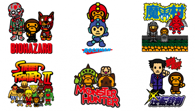 Friday, September 9, 2016 - 7:30pmHere's a fun surprise: BAPE are teaming up with Capcom to bring collab shirts to Tokyo Game Show 2016 (9/16 - 9/18)!
 -
 Wednesday, June 29, 2016 - 12:35pmLike clothes? Like Clutter? Know how to write a cohesive paragraph? You might be the guy or girl we're looking for. We need a streetwear expert to contribute to our awesome blog.
 Clutter is a FREE monthly print publication covering all things Designer Toy and Sub-Culture art. Founded in 2004 in the good old United Kingdom, Clutter moved to NYC in 2009 where it continues to grow.